Worldwide School
Worldwide School is a foreign language school.
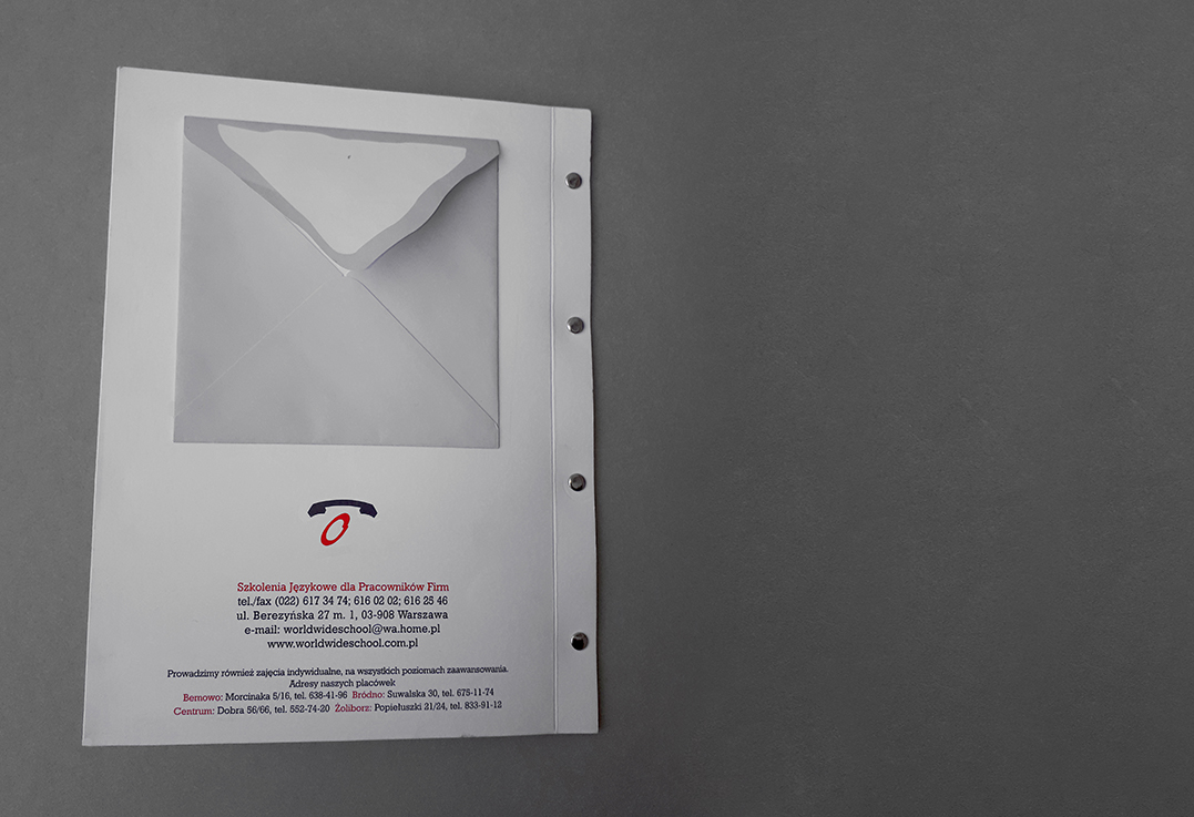
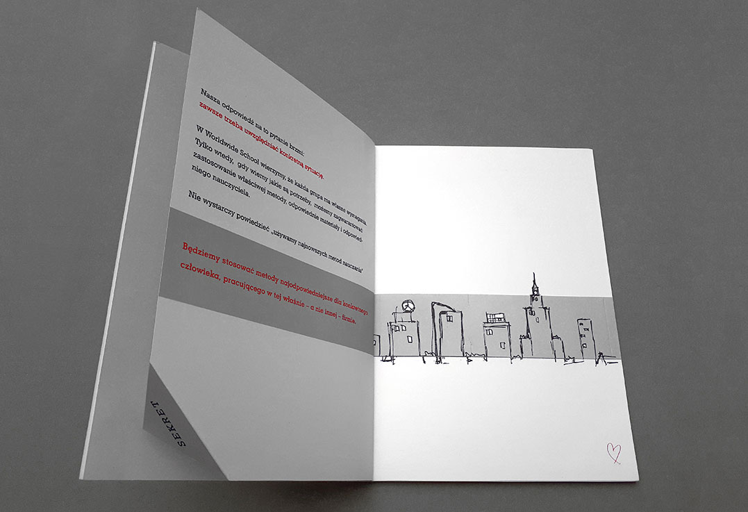
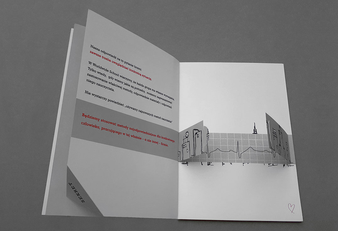
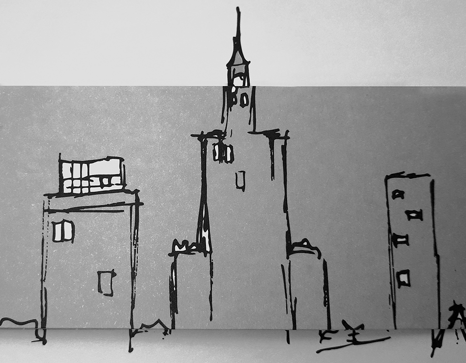
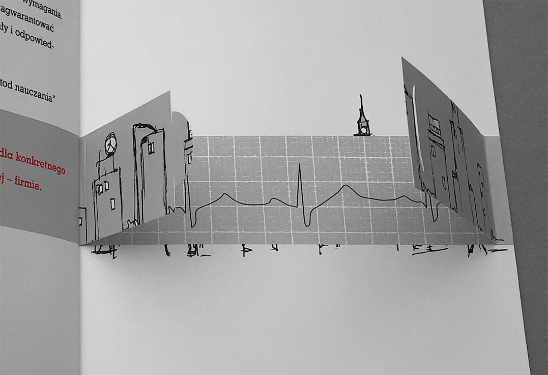
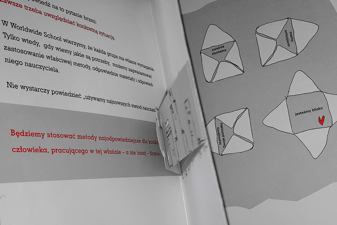
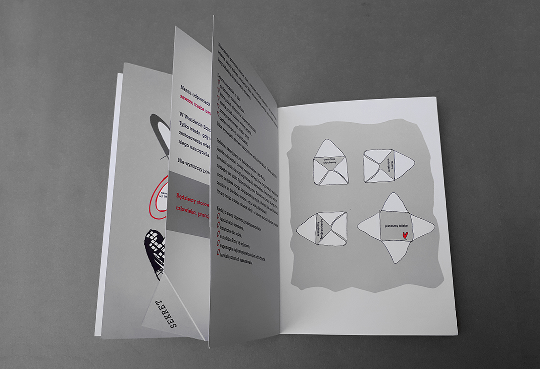
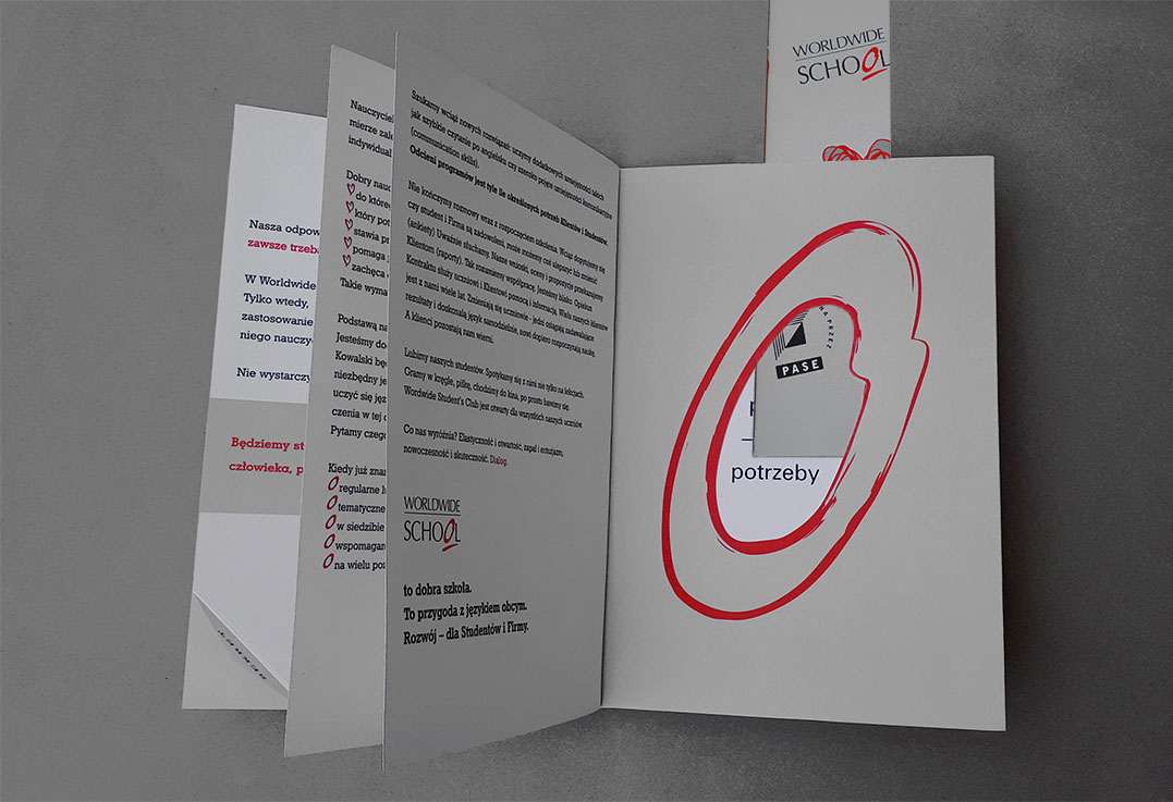
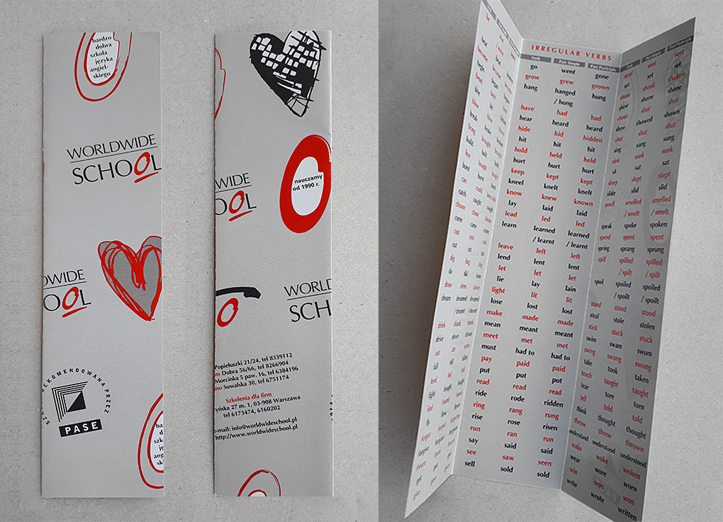
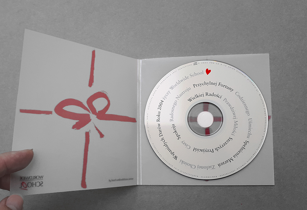
The task of the studio was to graphically design their offer of language training courses for companies. The client expected a non-standard form, which was to convince the uniqueness of the offer, the ability to go beyond the schemes, commitment to understand the needs and create individual teaching methods. He also expected an attractive and surprising graphic solution. “What makes us [Worldwide School] different? Flexibility and openness, enthusiasm, modernity and effectiveness. Dialogue”
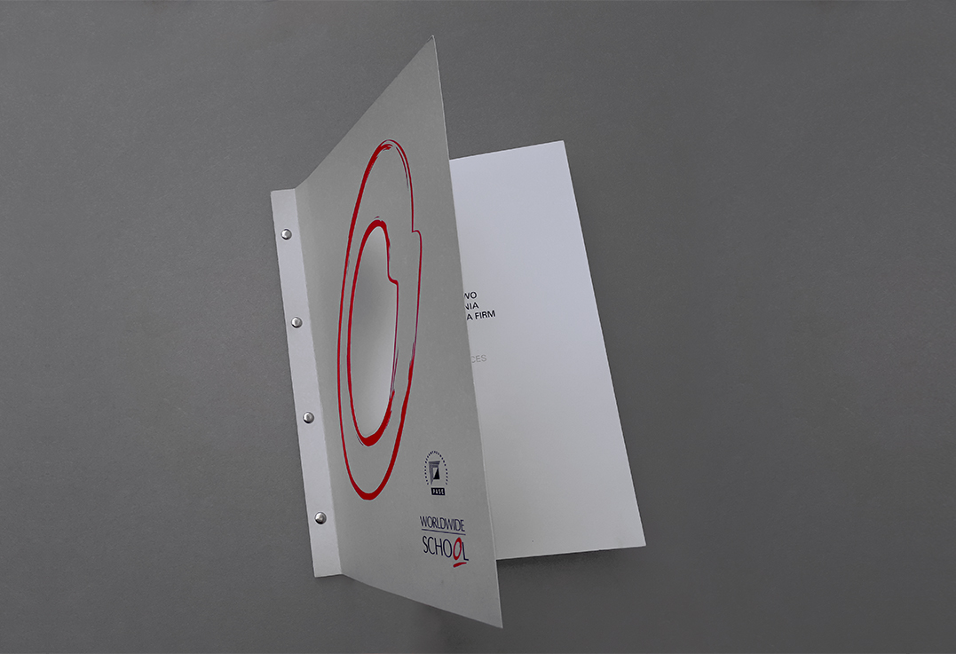
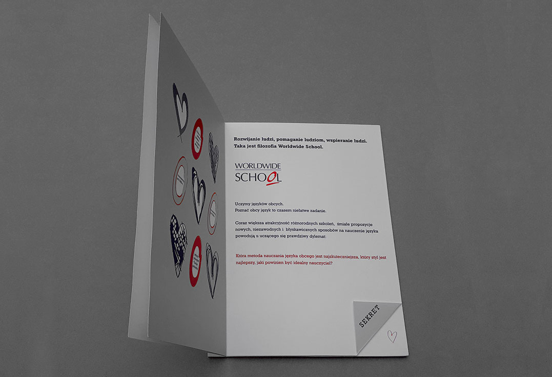
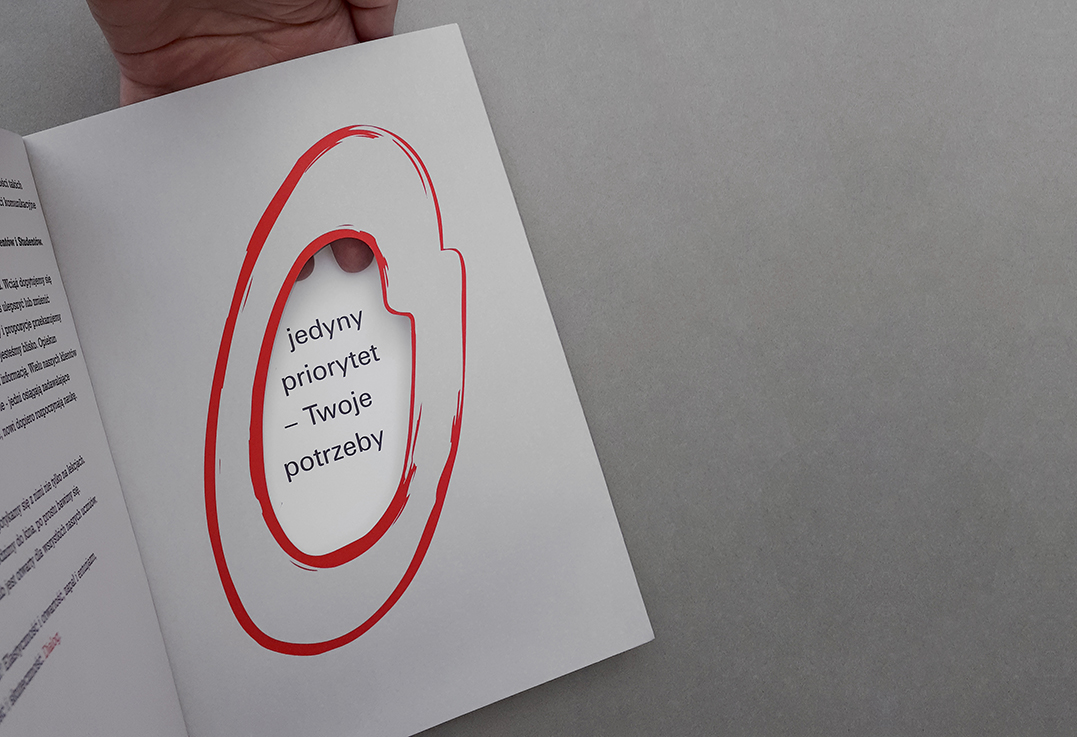
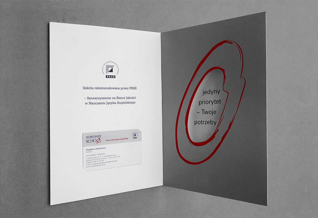
The challenge was the Worldwide School logo. It had in its graphic interpretation an unpleasant accent – reinforced with color and emphasis information about failure. The logo had a negative impact on the company’s image, but the Customer did not decide to rebrand. I proposed to broaden the interpretation of the logo (through play) in order to influence its perception. I have made many out of one. I created a “window” with different information inside, a heart, a phone, a clock, a cup and much more.
2001


