Chemman
Chemman produces cleaning products.
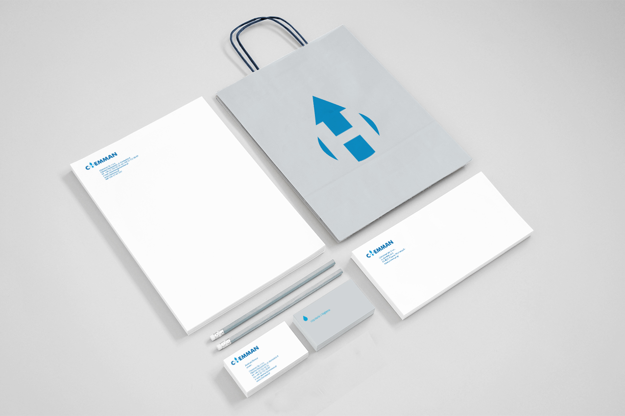
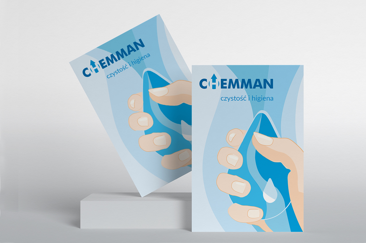
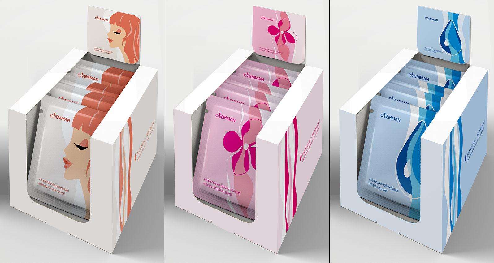
The task of the studio was to design a logo, visual identification and packaging for their soaked tissues.
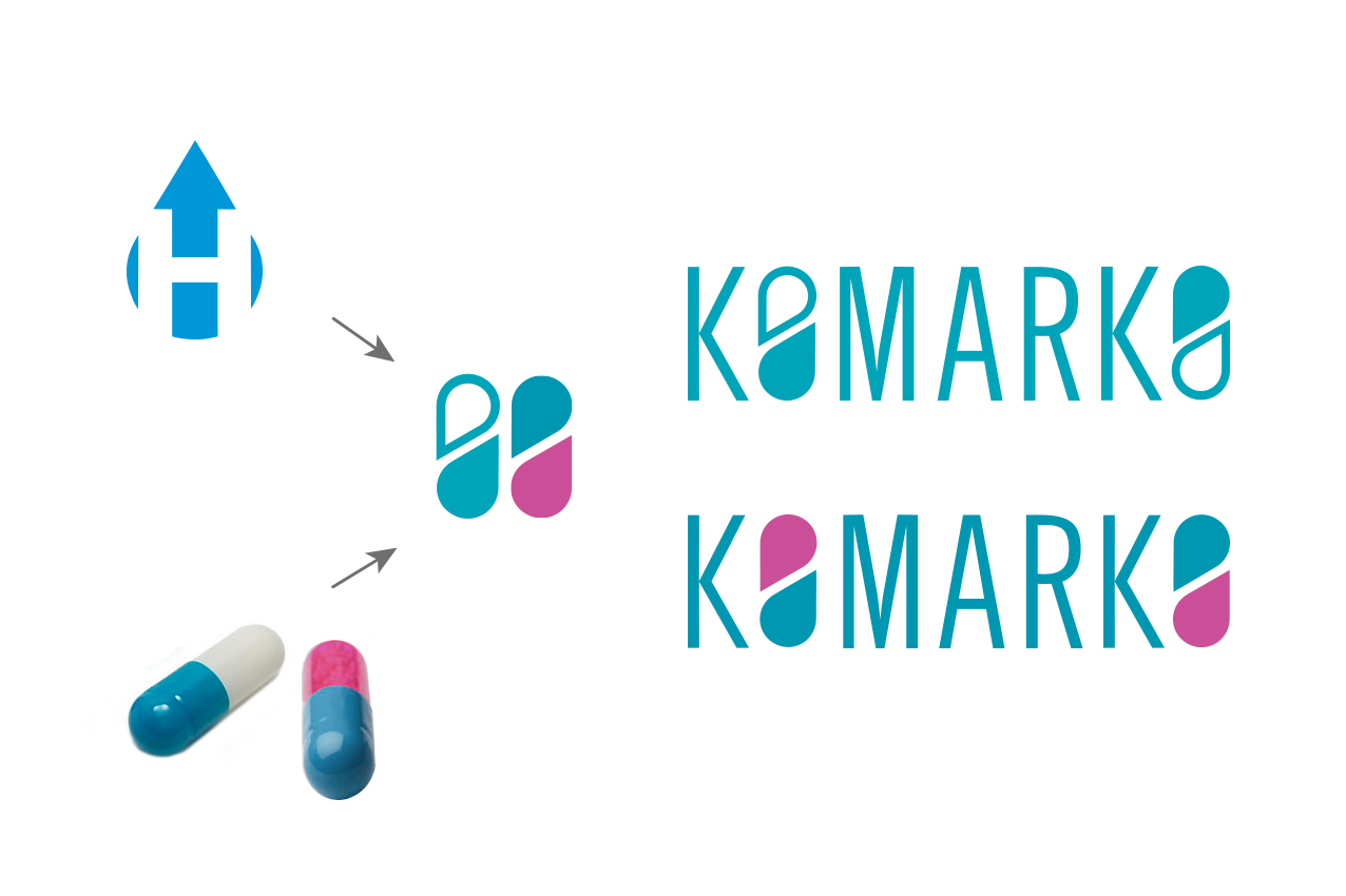
The design of the logo is unambiguous. A drop of water or solution, in a product necessary to maintain cleanliness. In the background there is an arrow. Pointing upwards, it suggests growth, progress – success. The Customer liked this message.
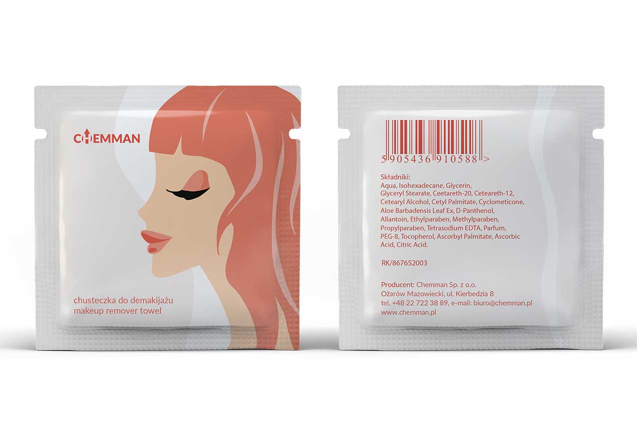
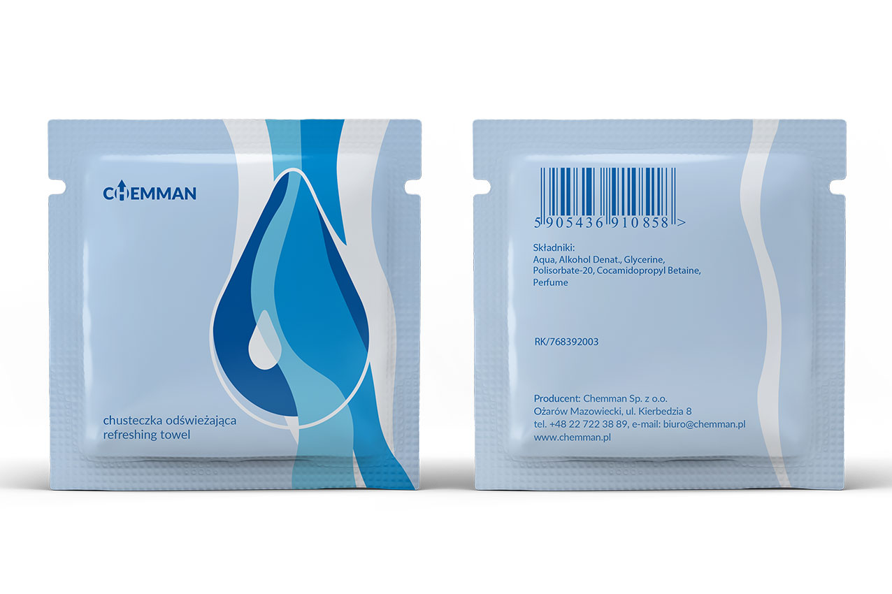
The illustrations on the packaging projects detail the use of tissues and emphasize their effectiveness.
In 2016, the company underwent a metamorphosis. It changed its name and changed its products. Komarko – deals mainly with the contract production of dietary supplements.
I designed a new logo for the newly established company. It refers (according to the brief) to both their previous products and their current activity.
CHEMMAN: 2005
KOMARKO: 2016